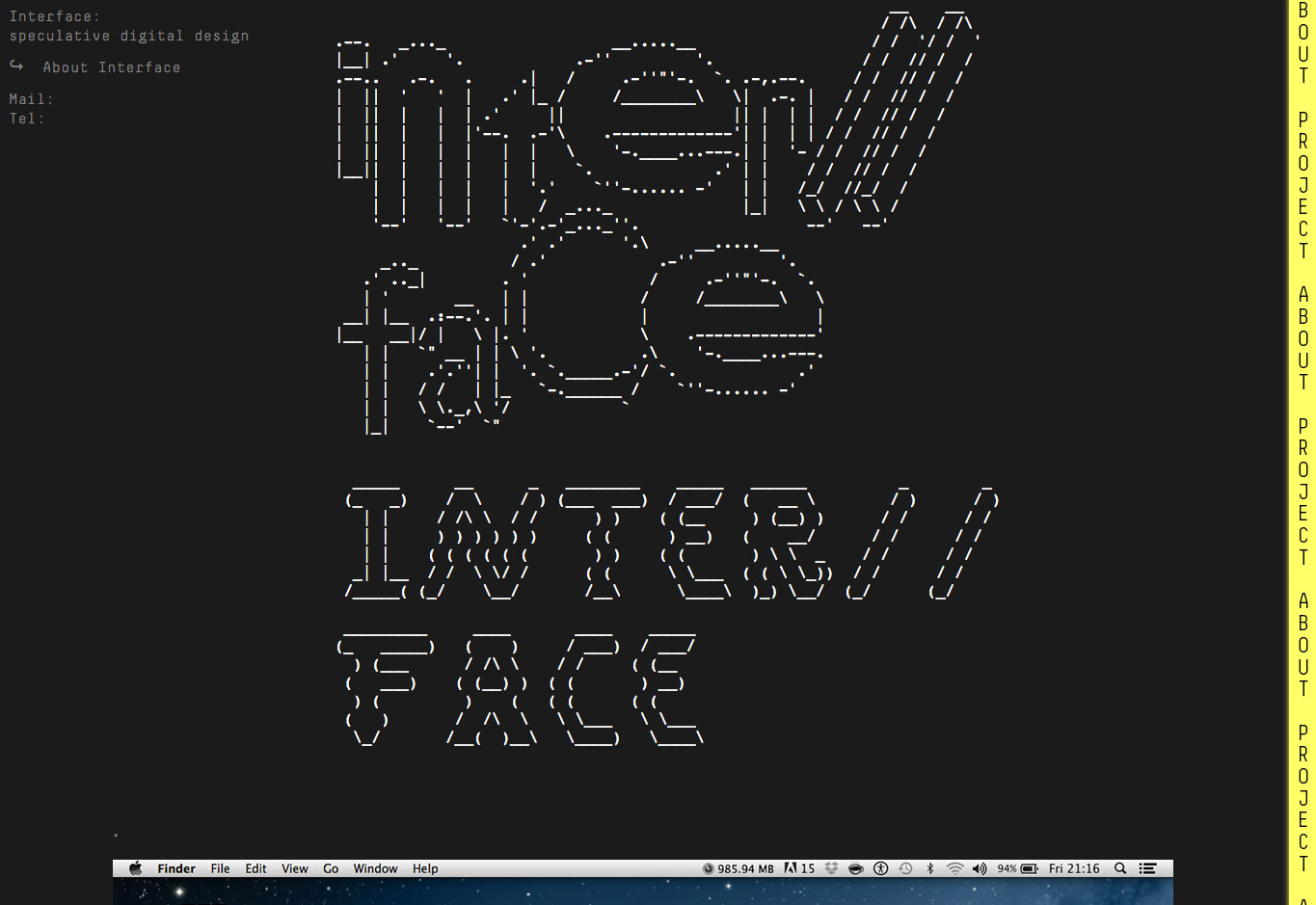
After the WWDC 2016, the key word “Brutalism in Web” come to my mind. It doesn’t like the standard concept of the web design, it roll everything based on our design rules to achieve the final minimalist. For me, as a web developer, The brutailsm website simply a combination of programing interface and the design theory.
what’s it
Originating from the French word for ‘raw’ (brut), Brutalism was first coined by Hans Asplund referring to architecture that made no effort to complement its surroundings. Seen as a reaction from the younger generation to the frivolity of the ornamental Beaux-Arts style of 1930s and 1940s architecture, Brutalism sought to expose the construction of a building with a return to basic materials. This philosophy resonates in the Brutalist web movement, only this time spanning from a generation who grew up with Microsoft WordArt and customizable MySpace pages.
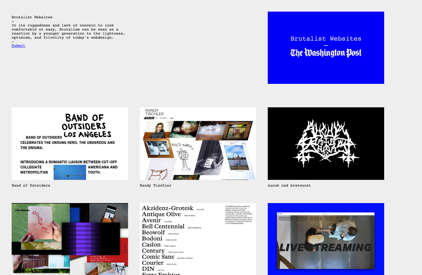
The trend exploded onto the radar after Creative Director at Freundliche Grüsse, Pascal Deville’s, website – http://brutalistwebsites.com – appeared on Hacker News last month and quickly went viral. The site showcases a selection of websites that Deville considers to have a Brutalist aesthetic, that is, marked by a “ruggedness and lack of concern to look comfortable or easy”.
Looking at brutalist websites, adjectives such as these spring to mind:
- harsh
- rough
- rugged
- uncomfortable
- raw
- confrontational
- cynical
how’s work
Everyone get their side about the brutalist web design. Some may want to make the website keep its simplify. Some may want to explore the unknown area about the balance of design and coding mixture, such as Nathaniel Smith of tilde.town explains, “I designed a brutalist website to show that we can still do wonderful things together on the web without so-called ‘best practices.” And one more side, many of the brutalist sites we stumbled across are purely designed as fun and games. Sites such as Is It Time For a Nap? (spoiler alert: it is) and The Endless Horse certainly put a smile on our face with their genius simplicity.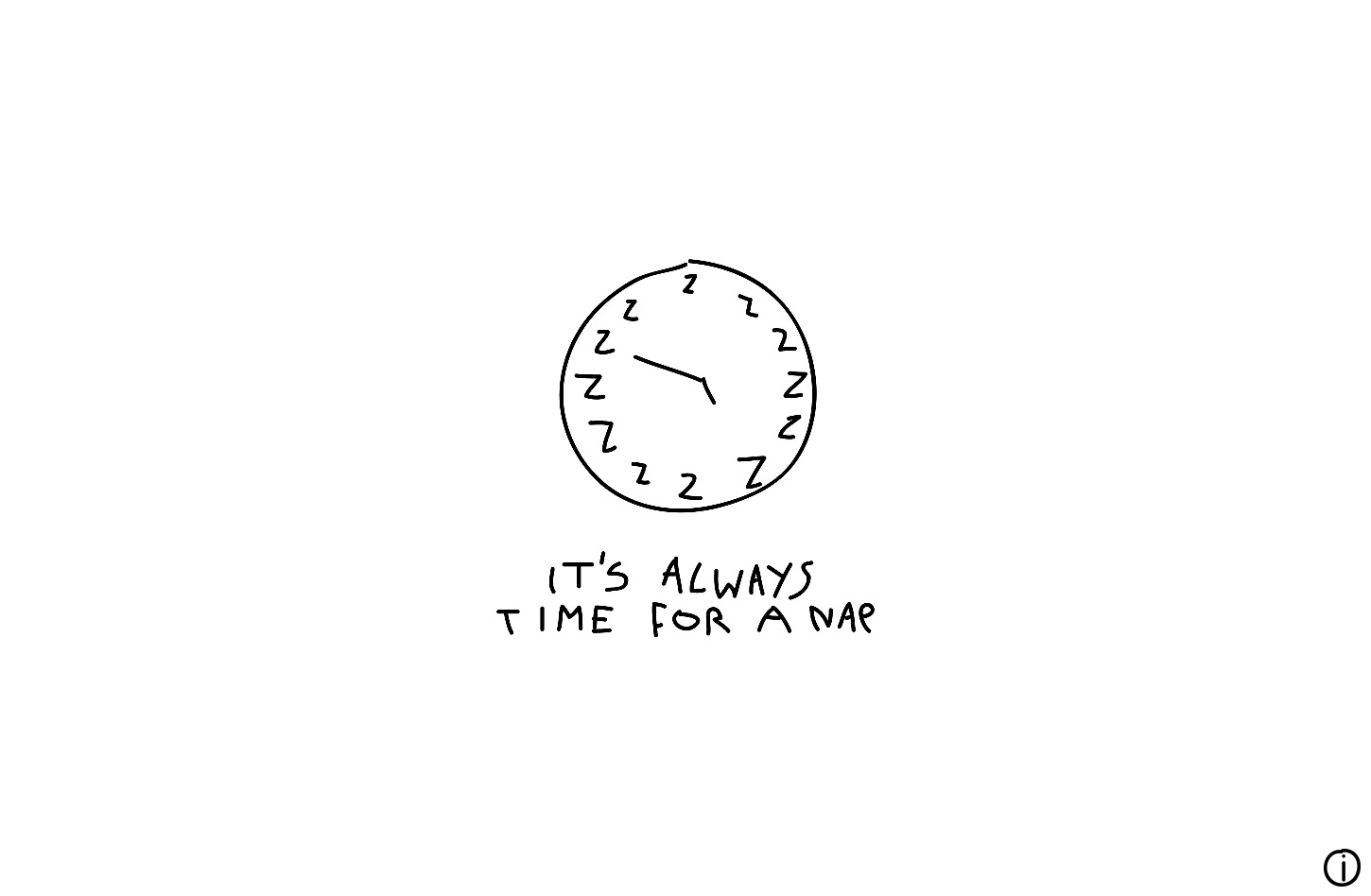
its a choice
Brutalism in web design has been around for a long time, but it’s really exploded into the public eye in recent months. If we broaden things past web design and go into architecture, then this design approach has been around since the 1950s.
What the body of evidence around brutalism makes clear, though, is that it is a design choice, above all else. It’s a knowing rejection of everything that’s attractive, easy on the eyes, and comfortable; and instead supports stark, raw ugliness in a sort of rebellion against design best practices that are meant to make us feel at ease and gives us something aesthetically pleasing.
As a result, brutalism is compelling, if for nothing else than to provide an alternative to the safe confines of design conventionalism.